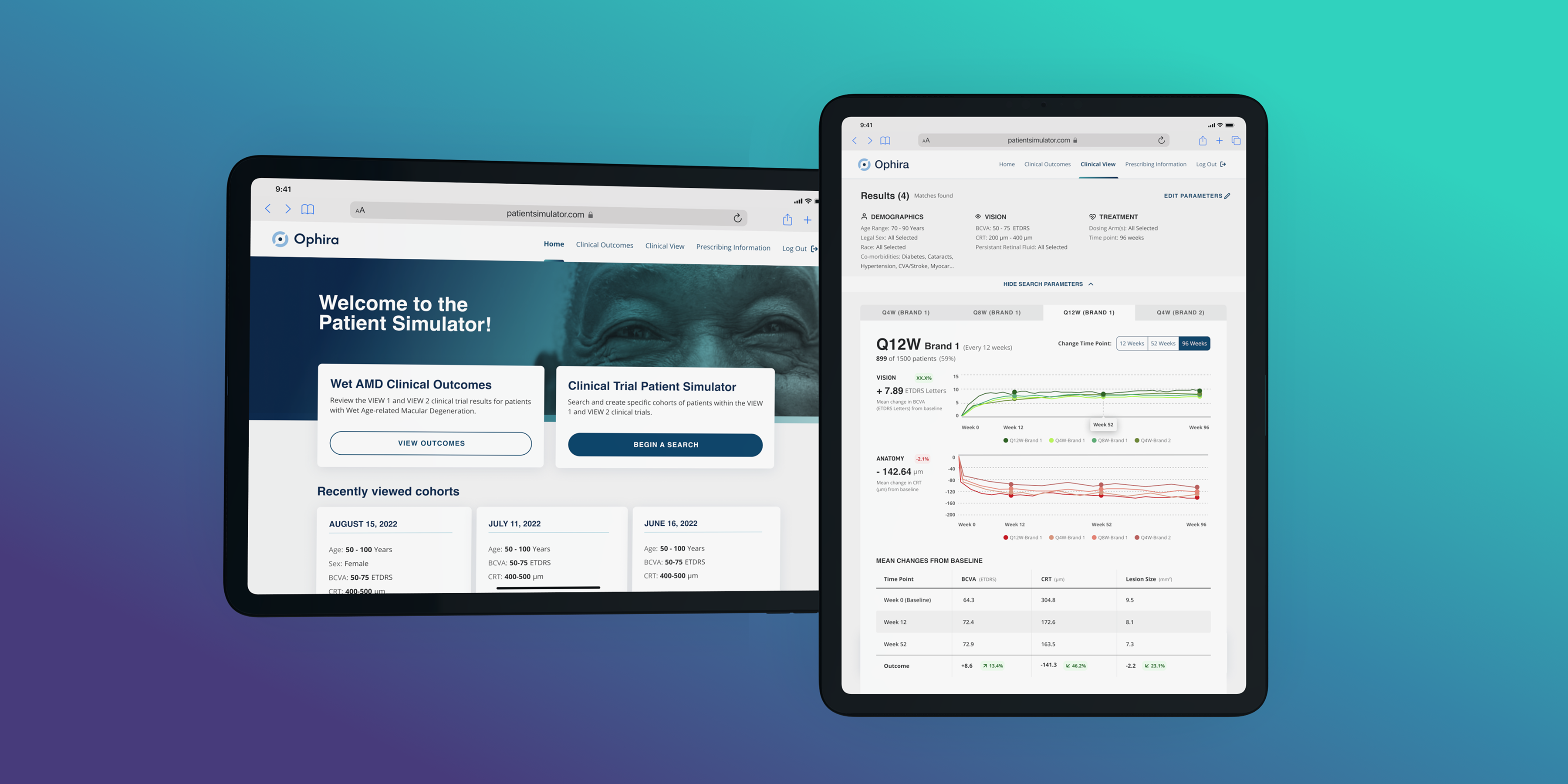

The platform had strong brand equity but lacked visual consistency, clear hierarchy, and optimized shopping flows. Product discovery and conversion pathways needed refinement to support growth.
• Conducted full UX assessment of the existing experience
• Identified friction across navigation, PDP, and browsing flows
• Ran user interviews and usability sessions
• Delivered prioritized redesign recommendations
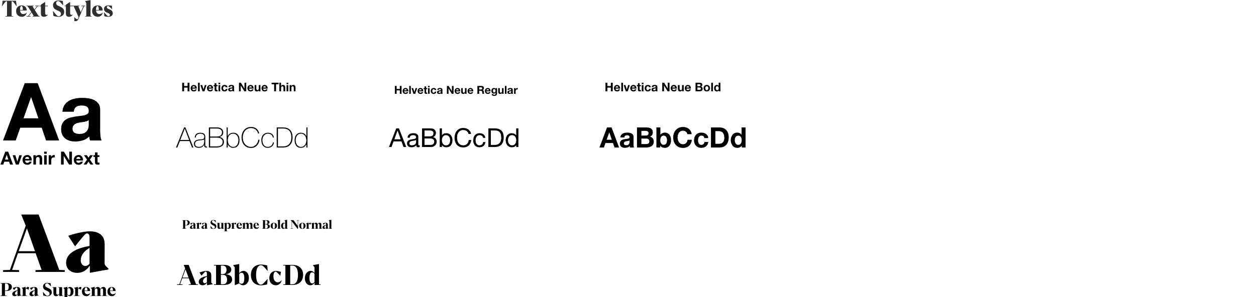
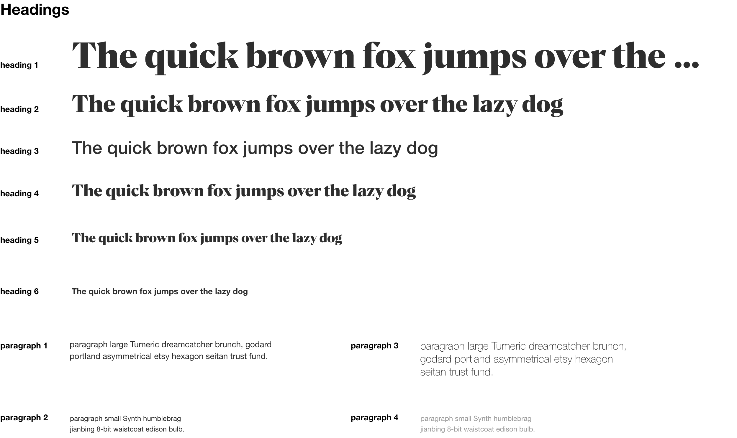
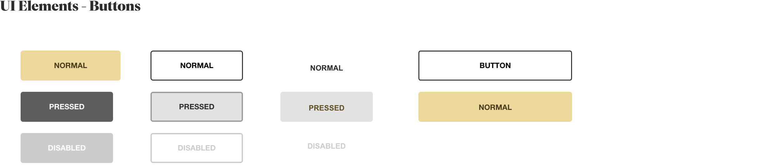
• Modernized UI and created a lightweight design system
The goal was evolution, not a rebuild.
• Strengthened visual hierarchy
• Simplified navigation
• Improved product grid clarity
• Refined PDP structure
• Standardized components across pages
• Elevated brand expression
The updated experience feels more premium, cohesive, and conversion-focused.
The redesign strengthened hierarchy, simplified navigation, refined product listing and PDP structures, and clarified call-to-action behavior. The updated interface reduced visual noise and improved scannability across breakpoints while preserving the brand’s identity and community-driven tone.


.png)
.png)
The redesign improved overall experience consistency and strengthened the platform’s visual and structural foundation. The continued partnership across multiple initiatives reflects stakeholder trust and ongoing product evolution.
The redesign strengthened hierarchy, simplified navigation, refined product listing and PDP structures, and clarified call-to-action behavior. The updated interface reduced visual noise and improved scannability across breakpoints while preserving the brand’s identity and community-driven tone.


I collaborated closely with developers to ensure design fidelity, delivering clear interaction documentation and responsive behavior guidelines. Ongoing QA support helped maintain alignment during implementation.
Following the redesign, we continued refining additional features and exploring new concept initiatives under the same brand ecosystem, building on the improved UX and UI foundation.