
Collaborated with the lead designer on efforts across UX strategy, interaction design, and responsive experiences, helping redefine an existing pediatric tool into an adult-focused product.
Worked alongside another senior designer, developers, medical stakeholders, and cross-market teams supporting international rollout initiatives.
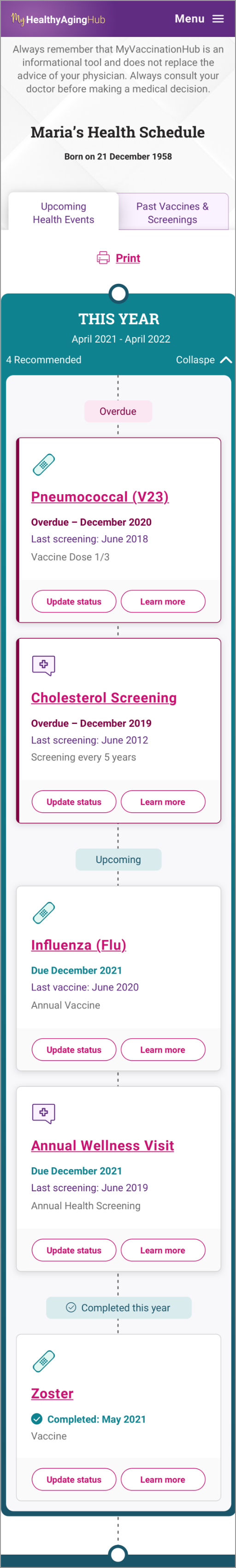
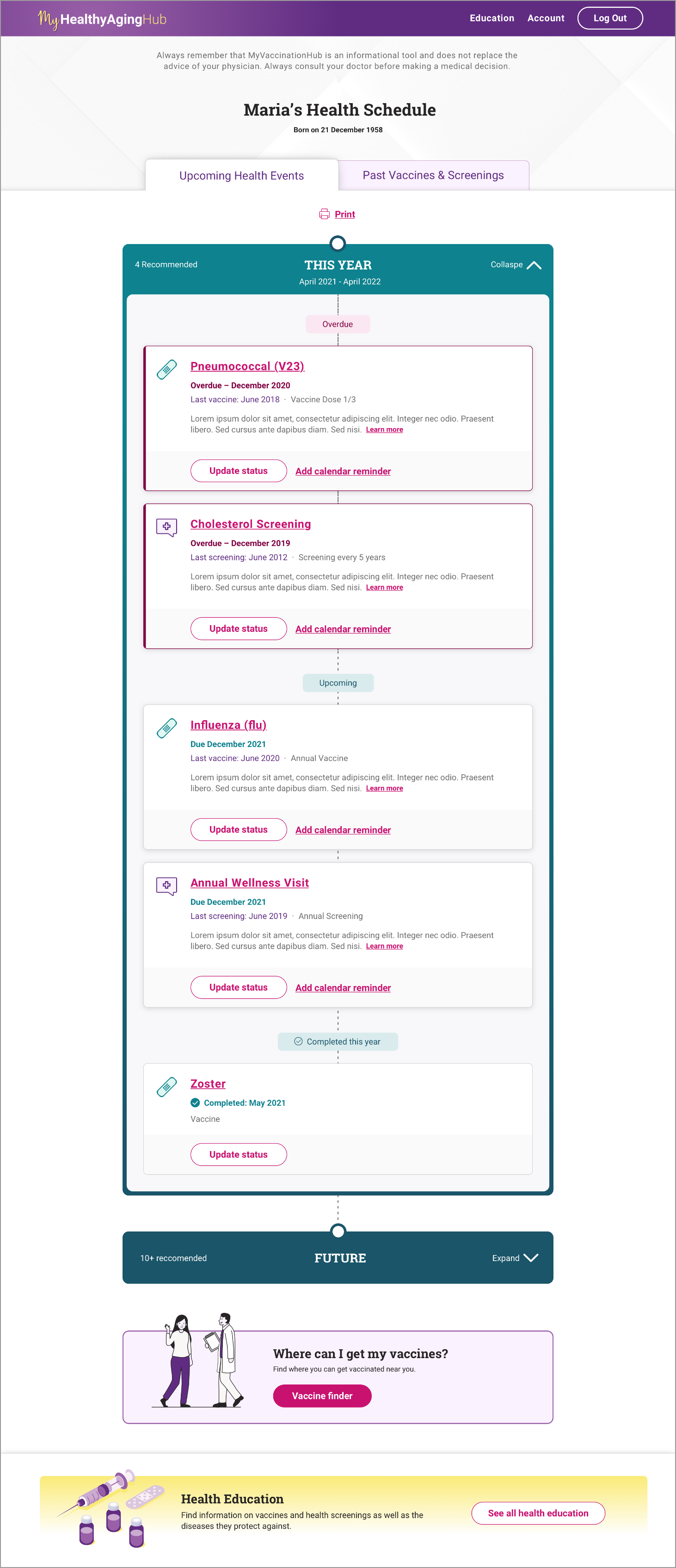
Responsive healthcare platform helping adults track vaccinations, screenings, and preventive health recommendations.
Increase engagement with preventive healthcare by creating clearer, more accessible experiences that support long-term health management.
Many adults rely on memory, provider visits, or fragmented records to manage vaccinations and recommended screenings, increasing the likelihood of missed preventive care.
The opportunity was to create a more approachable experience helping adults better understand recommendations while supporting scalable adaptation across multiple markets.
Exploring how clearer recommendations, approachable content, and scalable systems could encourage more proactive health management.
The experience was designed to encourage proactive health management through clearer recommendations, approachable education, and scalable interaction patterns.
Focused on experiences supporting ongoing health management rather than one-time interactions.
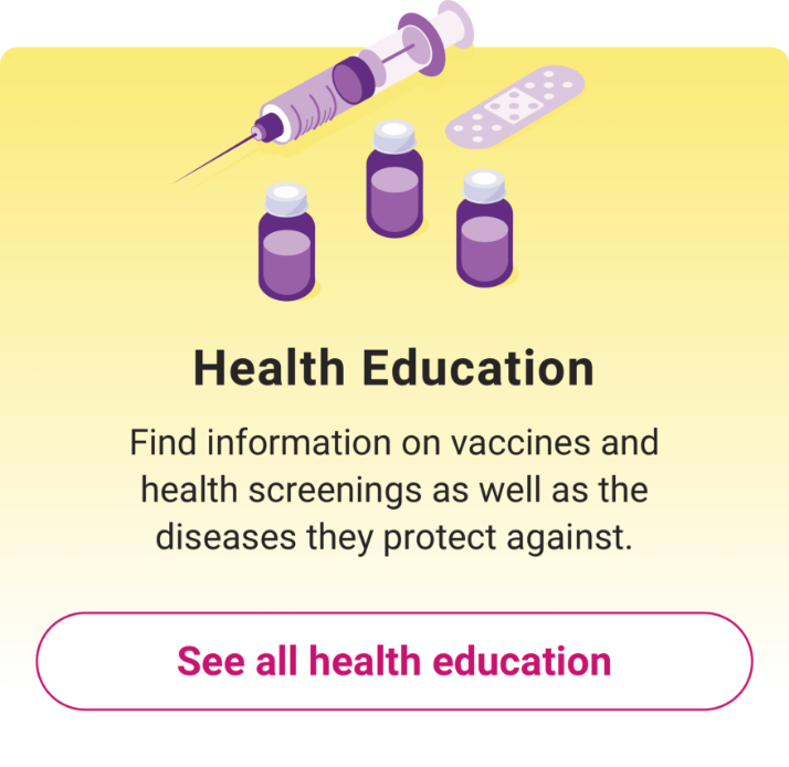
Reorganized educational content and recommendations into clearer, more digestible experiences.
Created scalable patterns capable of supporting localization and future market expansion.
Balanced approachable visual design with clarity and healthcare credibility.
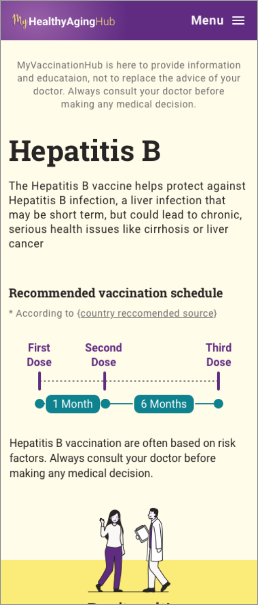
The final product was a responsive web experience that allows adults to track vaccinations, view personalized recommendations, and access educational content in a structured and approachable format.The interface balanced clarity and reassurance while maintaining flexibility for international rollout.
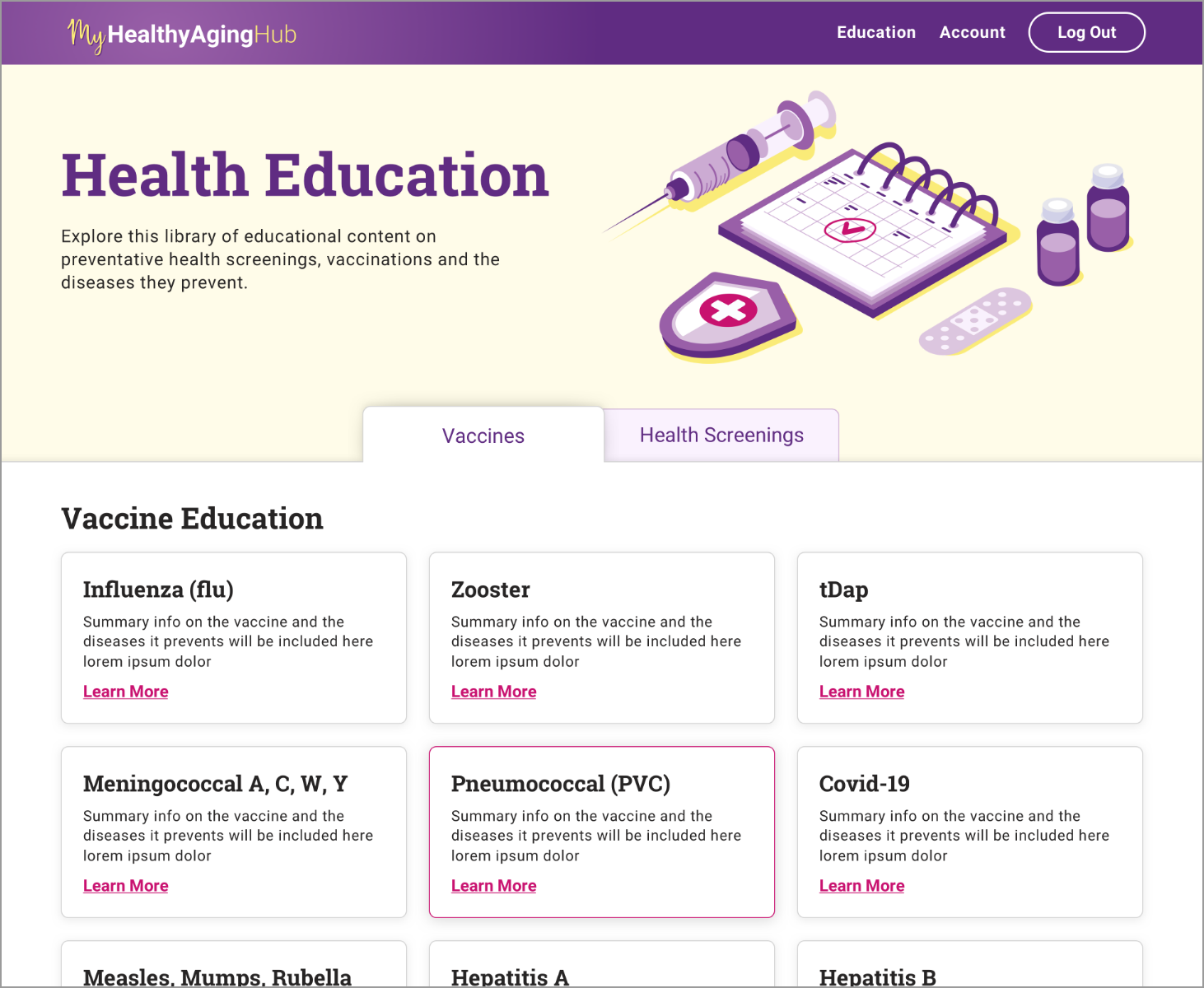
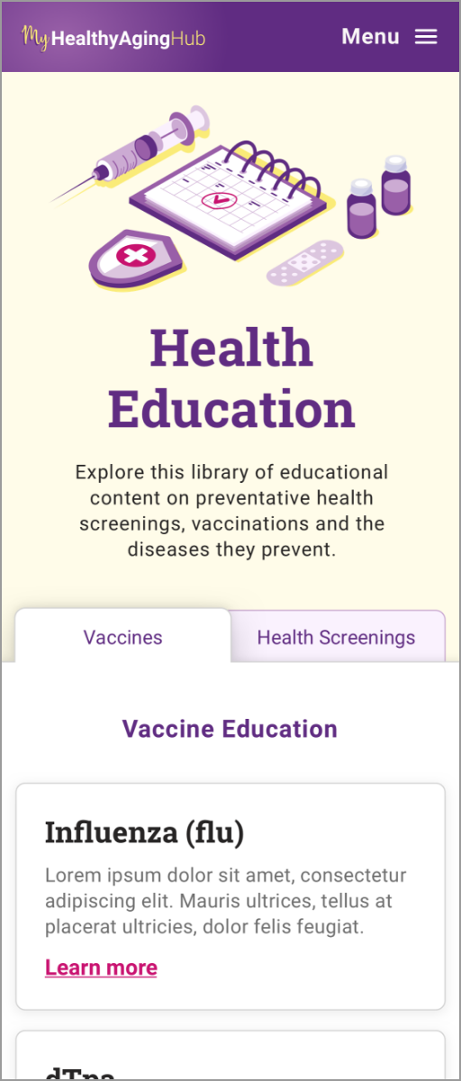
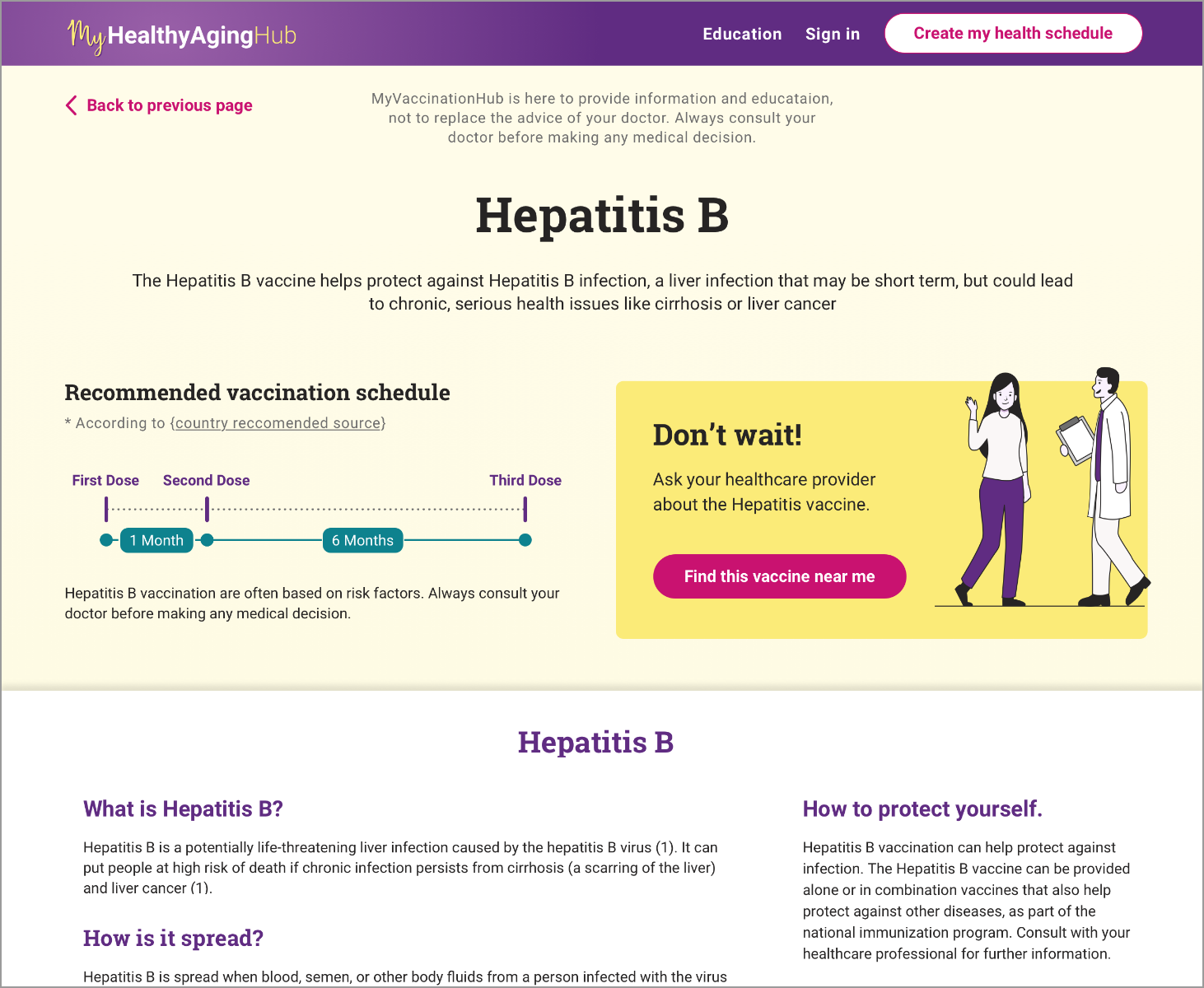
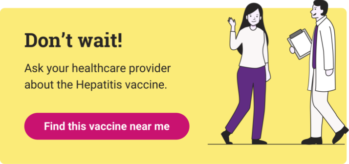
A new illustration system was introduced to better reflect adult users and support inclusivity across markets.
The visual language was modernized with bold purple accents, minimalist illustrations, and adaptable assets designed to scale internationally with minimal rework.
The result was a cohesive system that complemented the existing brand while differentiating the adult-focused experience.


Designing thoughtful, scalable digital experiences. Let’s design something meaningful together.
rhardodesign@gmail.com


.svg)